Simple Style Sheets
Or How to Improve Your Sleep by Dropping the Cascade
What happens when you drop the “C” from CSS? At Medium, we’ve been experimenting with a new way of using CSS to style our user interface components: a few months ago we started using small, atomic, and non-cascading classes instead of the usual BEM modifiers. The result is that we have a slightly more awkward but much more robust system of styling visual components.
Block Element Modifier
CSS has only one global scope. There are no namespaces, no local scopes: if you define a class—say author—to use on the story page, you have to be very careful to not to re-use the same class anywhere else because the same set of rules will be applied there as well. For generic components this is OK and even desirable: a Medium button should look pretty much the same on any page, after all. The complexity hides, as it always does, in the gray area of pretty much: what if you want a button to look slightly different but just on this one single page. Maybe here—just here—it makes more sense for it to not have a border?
In traditional CSS you would try to solve this problem with selector specificity: if your button should look different just on this page, you can overwrite its properties by constructing a selector specific to the page. But what happens if you want to share these additional properties across multiple cases where the button is used—but not all of them? What if you want to make buttons components that can sometimes be borderless?
To do this, we adopted a notation called Block Element Modifier. BEM allowed us to have a button (defined by a class button) that contained a label (button-label) that was sufficiently name-spaced to avoid conflicts with other labels such as form-label, link-label, and so on. We could also customize components and sub-components by adding modifiers to them. We could have borderless buttons defined by a combination of button and button--borderless classes.
The BEM notation was a very clever idea but our team struggled to scale it well. One case where things became particularly gnarly was setting offsets.
Offsets
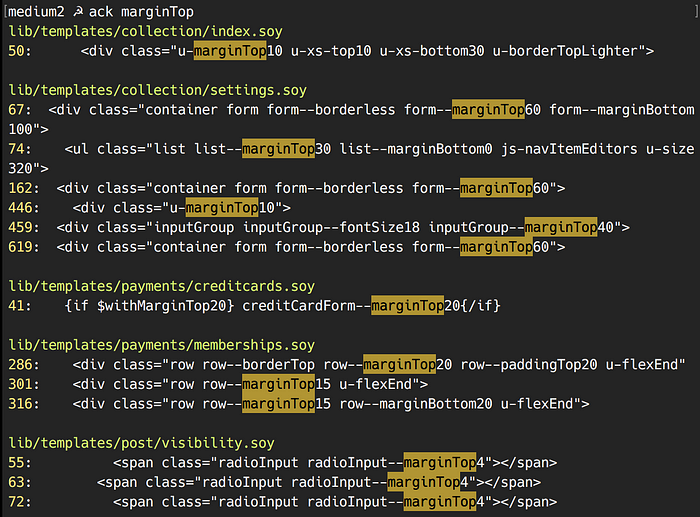
To lay out components on the page you need offsets which often depend on the environment where they are being applied. What do you do when Design asks for an offset of 10 pixels on the story page but an offset of 20 pixels on the home page? We used to use modifiers, such as button--padded, but quickly realized that we needed to be more specific. We started to add more specific modifiers and after a little while ended up with lots and lots of them. And, to add insult to injury, a big chunk of them were all doing the same thing. We had dozens of CSS classes applying same rules to different elements:

What It Is vs. How It Looks Like
The world we ended up with was a place where base classes described what elements were (a button, a menu) while their modifiers could describe either their looks or behavior (a button with top margin of 10 pixels). This was very confusing, especially for people who were not well-versed in the history and details of our usage of CSS.
To make things even more confusing, sometimes components didn’t behave the way you expected them to behave from reading their declared classes. You would see a primary button with classes button and button--primary expecting it to look just like any other primary button on the website. But that wasn’t always the case. Some pages and components were overriding the components and modifiers that made primary buttons, for example, have different colors and offsets. And if you were to modify the original button--primary you wouldn’t even know that you broke something unless either a bug was filed or you searched the codebase and carefully read all instances where the classes in question were mentioned.
One answer to this would be to strictly enforce the use of modifiers. We tried this approach and ended up in an episode of The Twilight Zone where nothing made sense anymore: button--primaryAndDarkGrey. And god forbid you’d want a padding on that.
It was also never clear when properties were overriding each other. You’d have a list--borderless making assumptions about padding for its items and if you wanted more padding you’d need to add list--itemPadded making everything even more confusing. It was impossible to tell how deep modifiers go with their assumptions.
Finally, trying to solve these problems with BEM introduced lots and lots of code duplication. Generally speaking, most components behave the same way: sometimes they have borders, sometimes their text is dark grey, sometimes they are hidden. With BEM, every component had to re-declare this over and over again. In the screenshot above there are two identical classes—creditCardForm--marginTop20 and row--marginTop20—that simply add a top margin of 20 pixels to whatever element they’re applied.
Via Negativa
The solution we’ve been experimenting with reduces CSS to its bare minimum and doubles down on Soy, our templating language.
I learned about this idea from a blog post by Adam Morse titled CSS and Scalability. Initially I dismissed it because I didn’t like his tone but, thankfully, I’ve been trained well by Nassim Taleb’s books to look past holier-than-thou writing. So I re-read the post a couple of times and the idea grew on me.
What if we reduced CSS to the smallest possible components that only described what elements looked like and how they behaved, and moved the rest onto Soy? Take this simple piece of code for example:
<span class=”u-marginLeft10 u-uiTextRegular”>
  {$membersCount |thousandSeparator}
</span>
We could try to make it a component or a sub-component (is this a label? is this label different from dozens of other labels on our website?) or we could say that it’s an element with a left offset of 10 pixels and text that uses our regular UI font. In future, if we want to make text yellow, we’ll simply add u-textColorYellow and move on with our day.
This code is robust. Unless someone goes in and changes u-marginLeft10 to have an offset of 20 pixels, this component won’t suddenly look different because of changes to an unrelated piece of CSS code.
But this code is awkward. If we go all-in with this approach, every button element will look like this:
<button class="u-displayInline u-positionRelative u-colorTextNormal u-backgroundTransparentBlack u-fontSizeSmaller u-textAlignCenter u-textDecorationNone u-fontStyleNormal u-cursorPointer...">
</button>
You get the idea. We can hide this behind our templating language:
{namespace views.ui.buttons}/**
 * ...
 * @param? isStyleSmallPill
 */
{template .generic}
  {let $classes kind="text"}
    // ...
    {if $isStyleSmallPill} u-paddingLeft10 u-paddingRight10
      u-height18 u-lineHeight16 u-verticalAlignMiddle
      u-fontSizeSmallest u-uiTextMedium{/if}
    // ...
  {/let}  <button class="{$classes}">...</button>
{/template}
You’ll still simply call views.ui.buttons.generic to render a button but debugging might get more difficult.
After more thought and some experimentation, we found a middle way: get rid of modifiers, leave non-atomic CSS only for low-level interface components (buttons, links, lists, and so on) and have the rest use these very specific atomic classes. The code below renders a button and adds top margin of 10 pixels to it on bigger screens and 20 pixels on extra small screens:
<button class="button u-marginTop10 u-xs-marginTop20">...</button>This approach drops the “C” from CSS and turns it into a simpler, flatter, and more robust language. It might not be pretty or very clever but it does something incredible: it allows me to leave the office every day without worrying that somewhere, on a page nobody has touched in ages, a button broke down again.


